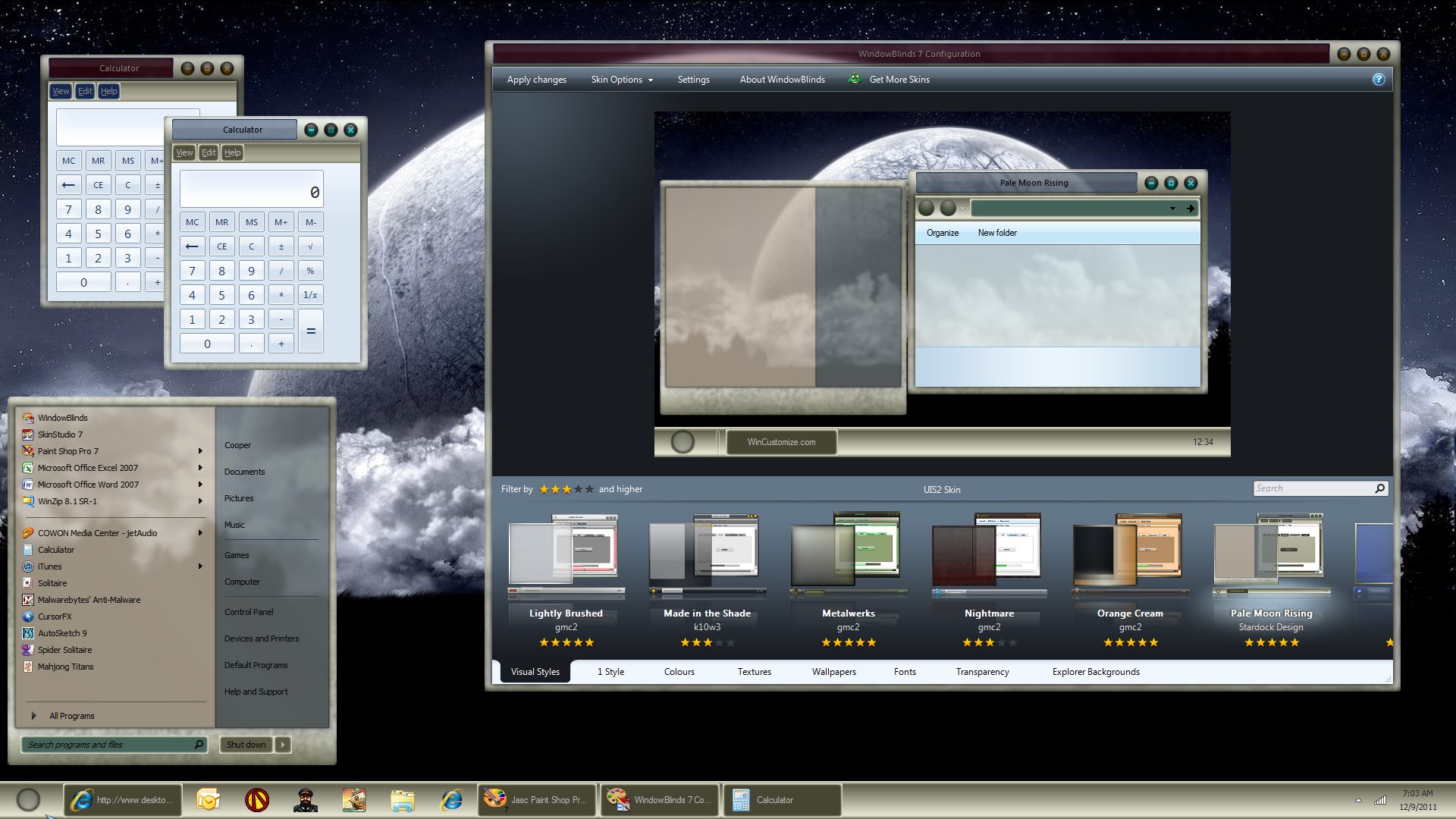
Pale Moon Rising

something I'm working on, and I like how it is going so far. not much glass or transparency and I'm thinking to make a substyle that will provide those aspects.


2,213 views 12 replies
Reply #1 Top

I like this idea although personally I think your text field/buttons could do with a "harder" edge to give it a little bit more definition and variation from the background but great work gmc2!

Reply #2 Top

thanks for the feedback roflnfaoo, the effect is intentional but I do understand what you mean.

Reply #3 Top

Very nice Greg. The colors and texture go very well with one another.

Reply #4 Top

Looks awesome keep up the great work :thumbsup:

Reply #6 Top

thanks guys for your comments, the blind is coming along nicely. Although I really like glass and transparency I wanted to attempt something based on solids. I will do a sub-style that includes those other aspects, just because...

Reply #7 Top

greg..i would go for more cooler colours (as in cool not warm) you have this insane wikked moon walpaper, but yet your wb colours are too warm (reds browns ect),,, just a suggestion my awsome comrade......

Reply #8 Top

Liking this a good deal, gmc2. Enjoying the texturing as well as the tones. Solid skinning. :)  :thumbsup:

Reply #9 Top

shucks Kitty, easier to change the wallpaper at this point, just getting ready to start on the substyle.

Doc, well, thank you for your encouragement, much appreciated.

Reply #10 Top

damn, I kind of like this blind but it's not on the top of my favorites list. I think any consideration of uploading is nil.

Reply #11 Top

Don't throw it away.... if you save it and revisit it later, you might have gotten new ideas in the meantime. A pity to waste good work. ;)

Reply #12 Top

thanks doc, I'll keep it on the back burner