2 issues
from  Sins Forums
I find the green directional arrows come up during battles if your cursor touches a ship.Shouldnt the directional arrows only show when you move a ship yourself not during auto move during a battle - it looks bad particularly on the Kol battlship.Consider making the arrows auto disable during combat.(the arrows look worse when zoomed in during combat and you happen to touch a ship with a cursor when moving around to enjoy the battle) they really destroy the visual experience.
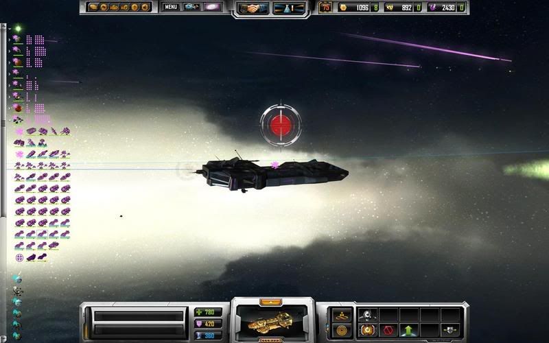
The red floating globes over ships which appear after a research field - they look ridiculous , please consider removing them .
both of these issues effect the visual experience please consider these points.
The red floating globes over ships which appear after a research field - they look ridiculous , please consider removing them .
both of these issues effect the visual experience please consider these points.